By Danielle Wallace | Fox News
The Georgia Department of Public Health apologized Monday for its most recent coronavirus data gaffe, explaining a “processing error” over the weekend had incorrectly shown a downward trend in the number of daily new infections.
In a tweet Monday from its official Twitter account, the department said: “Yesterday, a processing error inadvertently included 231 serologic test results among the positive #COVID19 cases. The error was corrected, but it caused a decrease in positive cases between reporting periods on our dashboard. We apologize for the error and the confusion.”
GaDeptPublicHealth✔@GaDPH
Yesterday, a processing error inadvertently included 231 serologic test results among the positive #COVID19 cases. The error was corrected, but it caused a decrease in positive cases between reporting periods on our dashboard. We apologize for the error and the confusion.48
Serologic tests are blood tests conducted to identify antibodies, or proteins produced by the immune system, in patients who may have been exposed to the virus or who have recovered from COVID-19. They are different from COVID-19 nasal swab tests, which determine whether viral genetic material is present in a sample collected from the back of the nose where it meets the throat.

In this April 16, 2020, file photo, Georgia Gov. Brian Kemp listens to a question from the press during a tour of a temporary hospital at the Georgia World Congress Center in Atlanta. (AP)
GEORGIA SAW 63K MORE OUT-OF-STATE VISITORS PER DAY IN FIRST WEEK OF REOPENING, SMARTPHONE DATA SHOWS
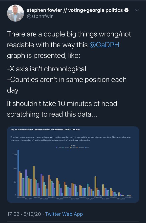
The apology came after the controversy last week over a bar chart posted on the state health department website that appeared to show new confirmed cases in the counties with the most infections had dropped every single day for the past two weeks.
In actuality, there had been no clear downward trend. The bar chart titled “Top 5 Counties with the Greatest Number of Confirmed COVID-19 Cases” was first posted to the department’s website on May 10.
Upon first glance, the bars, which were color-coded to represent each county, show a steady downward slope. But local GPB News radio reporter Stephen Fowler pointed out a “couple big things wrong/not readable” on the graph, including that the dates on the X-axis were not listed in chronological order and the counties weren’t displayed in the same position each day.
In a follow-up tweet, Fowler wrote, “There was a bad graph. DPH was asked and it changed after a day. This was one of many graphs on their site (and one of many errors).”
stephen fowler // voting+georgia politics✔@stphnfwlr
I’ve deleted this tweet from a week ago because it keeps getting aggregated and re-shared out of full context of what it does/doesn’t say.
There was a bad graph. DPH was asked and it changed after a day. This was one of many graphs on their site (and one of many errors)

“It’s just cuckoo,” Democratic state Rep. Scott Holcomb of Atlanta told the Atlanta Journal-Constitution on May 13. “I don’t know how anyone can defend this graph as not being misleading. I really don’t.”
In a Facebook post on May 11, Holcomb said he sent a letter to Republican Gov. Brian Kemp and “received a note back that the data was corrected to be arranged in chronological order.”
“I have two master’s degrees and have worked with a fair amount of data. I’ve never seen anything like this graph in my life,” he wrote.
By May 12, Holcomb said he discussed with Kemp over the phone how to better display data and had learned “the vendor who publishes the data on the DPH website thought it would be helpful.”
“I shared my opinion that it wasn’t,” Holcomb said. “This data is being used to inform state policy, and it’s also being used by individuals. It’s incredibly important for the data to be as accurate as possible and to be presented in a manner that is not misleading.”
Candice Broce, a communications director for governor’s office, explained in a May 11 tweet: “The x axis was set up that way to show descending values to more easily demonstrate peak values and counties on those dates. Our mission failed. We apologize. It is fixed.”
Pete Corson@petecorson ·
This graphic has been the subject of much head scratching by the @AJCInteractives team today. https://twitter.com/stphnfwlr/status/1259589739801456640 …
Candice Broce@candicebroce
The x axis was set up that way to show descending values to more easily demonstrate peak values and counties on those dates. Our mission failed. We apologize. It is fixed.22
Broce told the Journal-Constitution that the governor’s office does not choose the data the department of public health publishes on its website. Several social media users accused the health department of manipulating the data to show a desired outcome. Some suggested the graph was released to almost justify Kemp’s decision to broadly lift lockdown restrictions across the state.
Meanwhile, in Florida, the state official who managed the COVID-19 online dashboard confirmed she had been removed from her position, according to reports Monday.
In a farewell letter to colleagues distributed Friday, Rebekah Jones questioned the health department’s commitment to “accessibility and transparency.” Jones, the former geographic information system manager for DOH’s Division of Disease Control and Health Protection, said she has not had authority over the dashboard she helped create since May 5, according to the Miami Herald.


